Knapp Nanobrewery
Brand Identity
Positioning, Illustration, Design: Steffan Aune Håpnes
Challenge
Facilitating change in a rigid society is tough. Knapp Nanobrewery's aim to create a positive impact is a testament to the bravery needed to change the drinking culture in what once was the heartland of Viking society.
They needed a solid positioning to avoid resistance from the local community and a visual identity and nomenclature to convey their intent.
Process
Focused workshops, competitor analysis and consumer research revealed their brand truth: for Knapp, as a brave underdog it is about pushing boundaries, they wholeheartedly wants to change the way Norwegians approach beer drinking. We translated this insight into a purposeful and actionable mantra for the brand; 'Courage, action and then transformation' (Mot, handling så forandring).
The Identity
The identity heroes Knapp's stance as a brave underdog. From a logo that visually pushes boundaries, to bold graphic illustrations and a strategy that celebrates the local community by including them in several touching points, from involving them in the brewing process to commissioning local photography and sourcing locally grown ingredients.
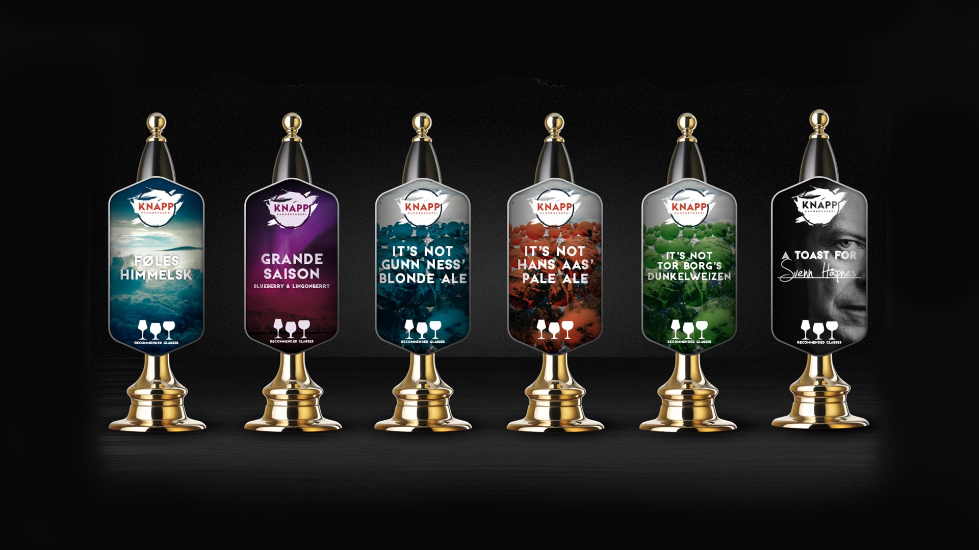
Brewing Themes
The brewing themes are designed to support Knapp's strategy by helping people think differently about beer. Two themes honour people worth celebrating by encapsulating their key characteristics.
One theme embraces the aspect of feel. Knapp would analyse and come to a creative solution to how for example heaven, surprise or anger would taste like.
While their last theme, 'It's not...', solidifies their stance as a brave underdog by disguising major breweries as actual names and brew sorts they are not serving. For the sake of example, Guinness and they are not serving lager, this would become 'It's not Gunn Ness' Lager'.
Impact
The outcome went far and beyond what the client was initially expecting. They embraced the identity and applauded it as an actual extension group mentality and personality. While incredibly happy with the visual identity it also stood apart from their competition making it a business tool that would make it much easier to communicate and tailor messages to the target audience.